It’s super easy to think that once the translation is done, the job’s finished. But if your freshly translated content looks like a clunky wall of text or like it came straight from a Word doc with zero formatting finesse? That’s probably going to be a hard pass from your reader.
Typesetting transforms a decent translation into polished, professional communication. It’s the final touch that makes your content feel intentional—no matter the language. At Atlas Translations, we work with experienced typesetters who understand how design and language go hand in hand and how getting it right can make all the difference.
Fantastic! But what is typesetting?
In plain terms, typesetting (also known as desktop publishing or DTP) is the process of arranging text and visuals so that a document doesn’t just say the right thing, it looks the part, too.
Think of it as the visual glue holding your translated content together: font, layout, alignment, spacing, punctuation, and even how bullets or line breaks appear from one language to the next.
Professional typesetting services make sure that what lands on the page isn’t just accurate but accessible and engaging, especially when you’re working across multiple languages with very different rules and visual quirks.
A long time ago…
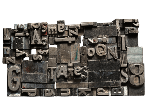
In a galaxy far, far away, the type consisted of small blocks of individual or groups of letters made from ceramics, ivory, wood, and eventually metal. The type were essentially stamps that were used, with ink, to create documents for printing. The person responsible for arranging the blocks to make the words that made the documents was called the typesetter. They were likely very patient people who didn’t get paid anywhere near enough!
Luckily, humans invented technology, so now we have software to help preserve our words (and eyeballs).
Why B2B clients should care about typesetting
You’ve invested time and budget into translation and localisation, and rightly so. But skipping typesetting? That’s like planning a product launch and forgetting the packaging.
Here’s what typesetting brings to your B2B projects:
Global reach without the formatting headache
Multilingual content often expands, shrinks, or reshapes itself in unpredictable ways. One language might use 30% more space than English. Another might read right to left. Some languages don’t even use capital letters or italics (looking at you, Arabic and Chinese).
Professional typesetters handle this chaos with calm. They adapt layouts to suit the quirks of each language—without distorting your message or breaking your brand guidelines.
Consistent branding across markets
Your tone of voice might be spot on, but do your layouts look like they’ve been stitched together by three different people using five different templates? Well, congrats, because the trust you worked so hard to build is about to disappear faster than free doughnuts in the employee kitchen.
Atlas Translations makes sure your translated materials look the same across every language and location. That means:
- Using fonts that match your brand (and, hey, actually support the right characters)
- Clean, structured layouts, even for complex scripts
- Cohesive formatting from brochures to manuals to legal docs
Consistency like this keeps your brand credible and professional wherever your words go.
Less rework, more ROI
Let’s talk budgets. Investing in typesetting upfront saves you money in the long run. Why?
- You won’t waste time on revisions because of awkward text breaks or misaligned images.
- You won’t need to retranslate sections just to fix formatting errors.
- You get print- or publish-ready files that are accurate and attractive.
In short, global reach + consistent branding = better return on investment (ROI), all through materials you’re proud to share.
What about B2C clients?
If you’re not an organisation but you are someone who needs a certified translation of your birth certificate, a court document, or some medical records, you probably don’t think about layout until it’s too late.
Bad formatting in documents and applications can cause delays in processing official documents or, worse, rejections. That’s why Atlas Translations offers typesetting services for personal translations, too.
We make sure that:
- Your translated document matches the format of the original
- All seals, stamps, or specific layouts are preserved properly
- The target document (what we give you) looks as official and trustworthy as the source document (what you give us)
Because when it comes to personal paperwork, truth, accuracy, and stellar presentation go hand in hand.
Typesetting in practice: things you might not know
Some languages need more finesse than others. Here are a few real-world considerations we deal with regularly:
The German language loves to use long compound words, which can often break layouts.
The Japanese and Chinese languages don’t use italics—so text emphasis needs a rethink.
In languages such as Arabic and Hebrew, any written text will require full layout mirroring due to being read from right to left.
Non-Latin characters can wreak havoc on font compatibility if you’re not careful.
And that’s just the start 😑
It’s why working with a seasoned typesetting team, especially one integrated into a translation agency, pays off in accuracy, aesthetics, and… sanity.
Why Atlas Translations?
We’re not just ticking boxes. We’ve been handling multilingual typesetting for decades, helping brands communicate clearly, culturally, and confidently.
Our typesetters and designers work in over 300 languages and understand how to marry language and layout in a way that works. From brochures and training manuals to certificates and technical guides, we make sure the finished result looks like it was made to be in that language from the start.
It’s a wrap
Typesetting may not always steal the spotlight, but it’s the behind-the-scenes detail that can tie the whole translation project together.
For businesses, it means consistent branding, reduced errors, and a smoother road to international engagement. For individuals, it means confidence that your documents will be accurate and will look the same as the instructions said they should.
When done properly, typesetting doesn’t just support your message, it becomes part of it.


